Scan Canada
Case Study
Scan Canada is an app I designed that lets people scan products and instantly check if they’re made in Canada. The idea was to create something quick, easy, and fun to use while also helping shoppers support local businesses. I focused on keeping the design modern and clean with bold Canadian branding so the app feels trustworthy and simple.
Scan Canada is an app I designed that lets people scan products and instantly check if they’re made in Canada. The idea was to create something quick, easy, and fun to use while also helping shoppers support local businesses. I focused on keeping the design modern and clean with bold Canadian branding so the app feels trustworthy and simple.

Emma Walton
App Design
Local Shopping, Made Simple
The main challenge was building a mobile experience that made identifying Canadian-made products effortless. Many shoppers want to buy local but struggle to interpret labels or verify sourcing quickly. I focused on refining colour, hierarchy, and layout to make scanning as simple as opening the camera and receiving a clear product breakdown, ingredients, sourcing, branding, and certification, within seconds.
Canadian Identity, Instant Results
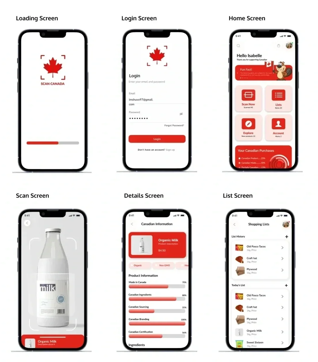
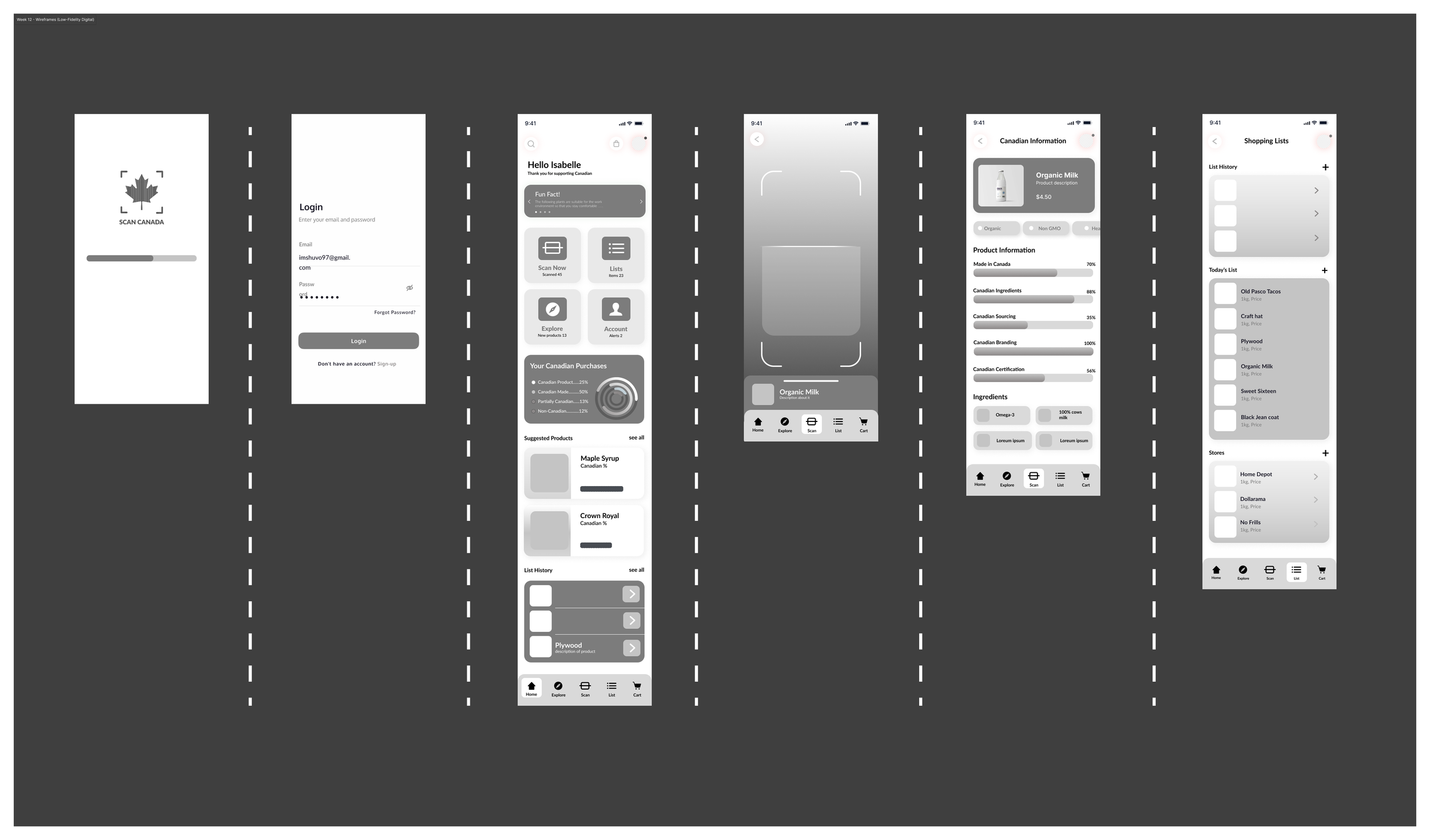
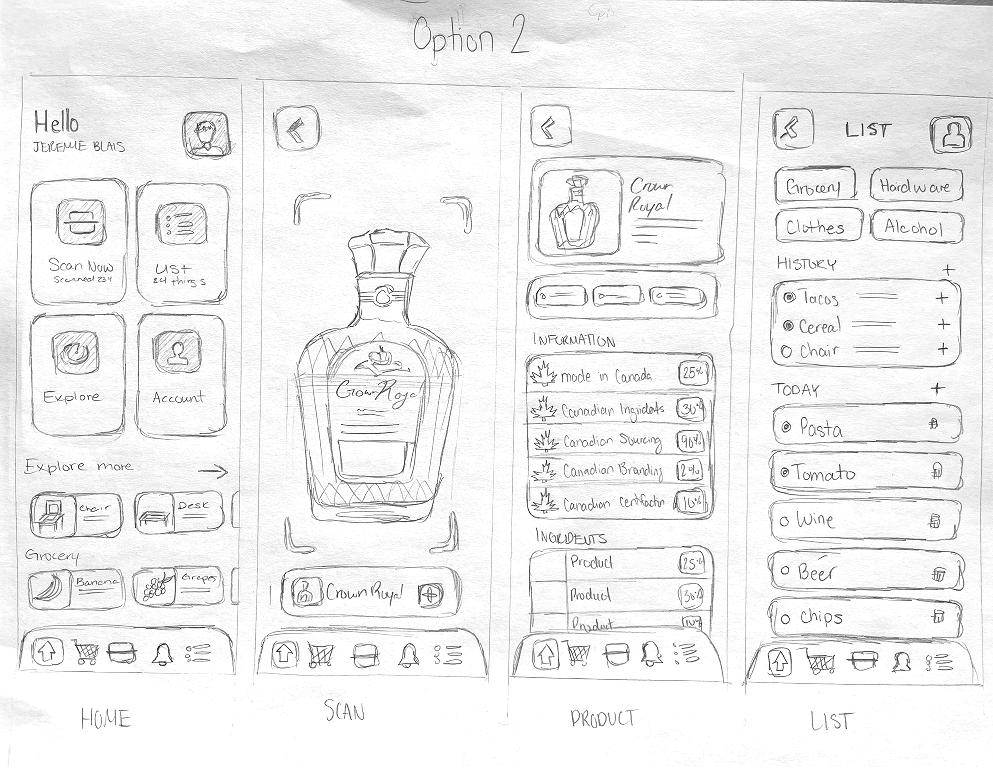
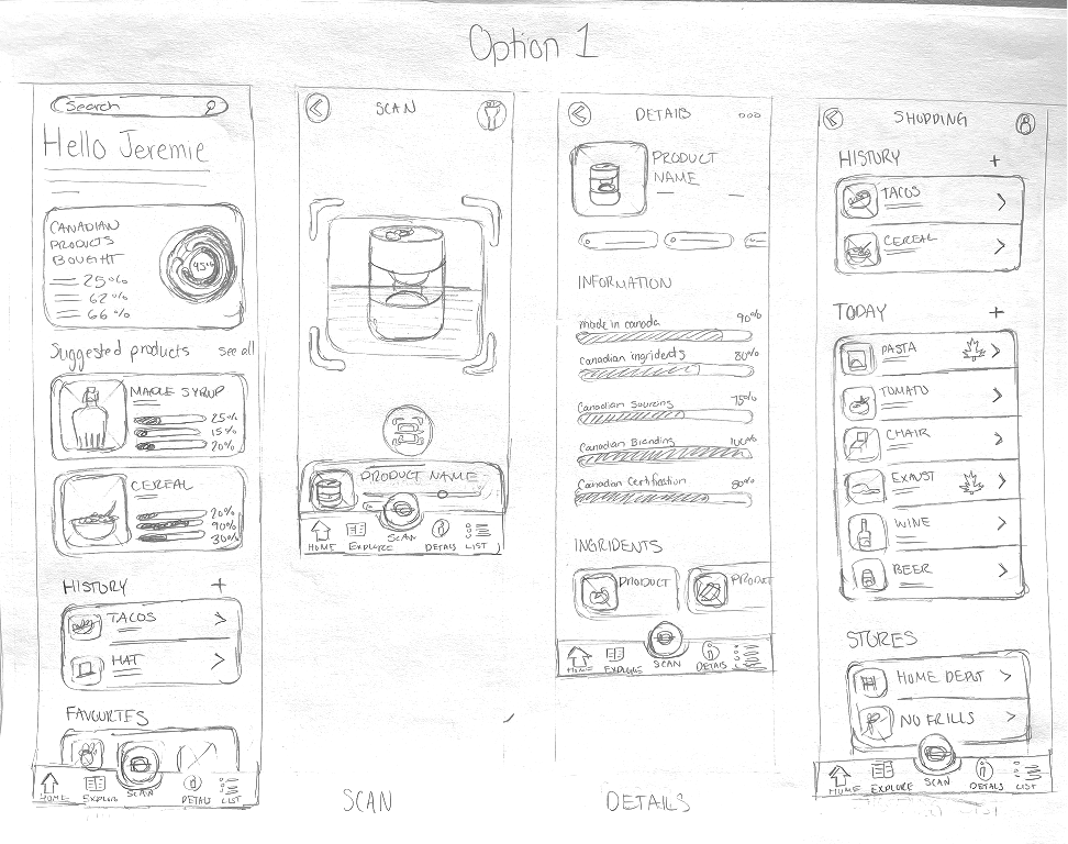
The final design includes polished screens for login, the home dashboard, scanning, product details, and saved lists. Built in Figma, each layout uses strong reds, clean structure, and friendly visual cues. Multiple variations were tested to ensure progress bars and percentages were easy to read at a glance. The result is an app that feels quick, rewarding, and proudly Canadian helping shoppers make informed choices with confidence.