BEER CAN DESIGN
Case Study
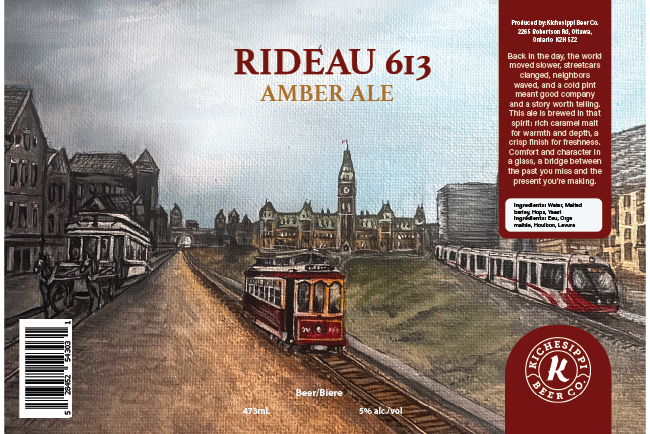
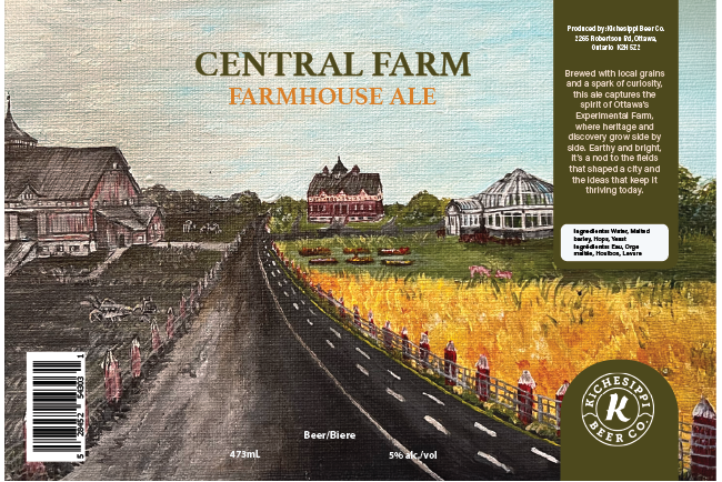
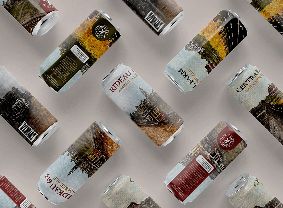
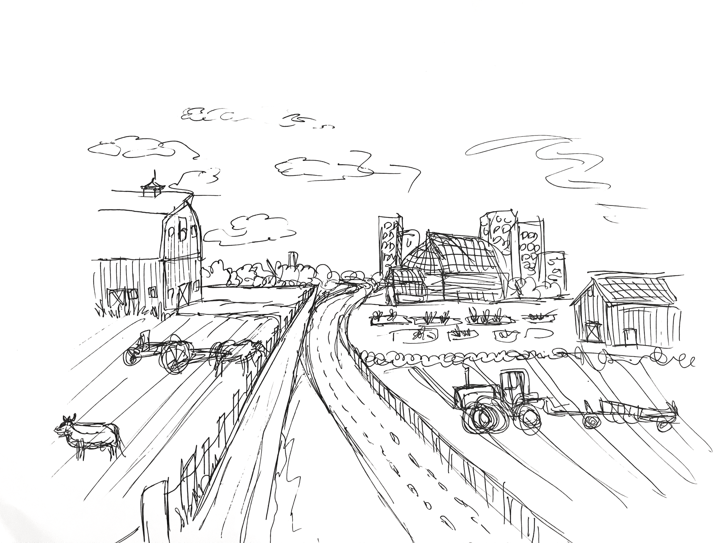
For this series, I created two custom beer can labels inspired by iconic moments and locations in Ottawa’s history. Each illustration began as a hand-painted artwork, then was carefully refined and adapted into a full wrap-around label. The goal was to merge local storytelling with craft beer branding, giving each can a nostalgic and collectible character while remaining consistent with Kichesippi’s visual identity.
Client: Instructor — Jamie McLennan
Project: Beer Can Design
Role: Branding & Packaging Design
Type: Academic Project
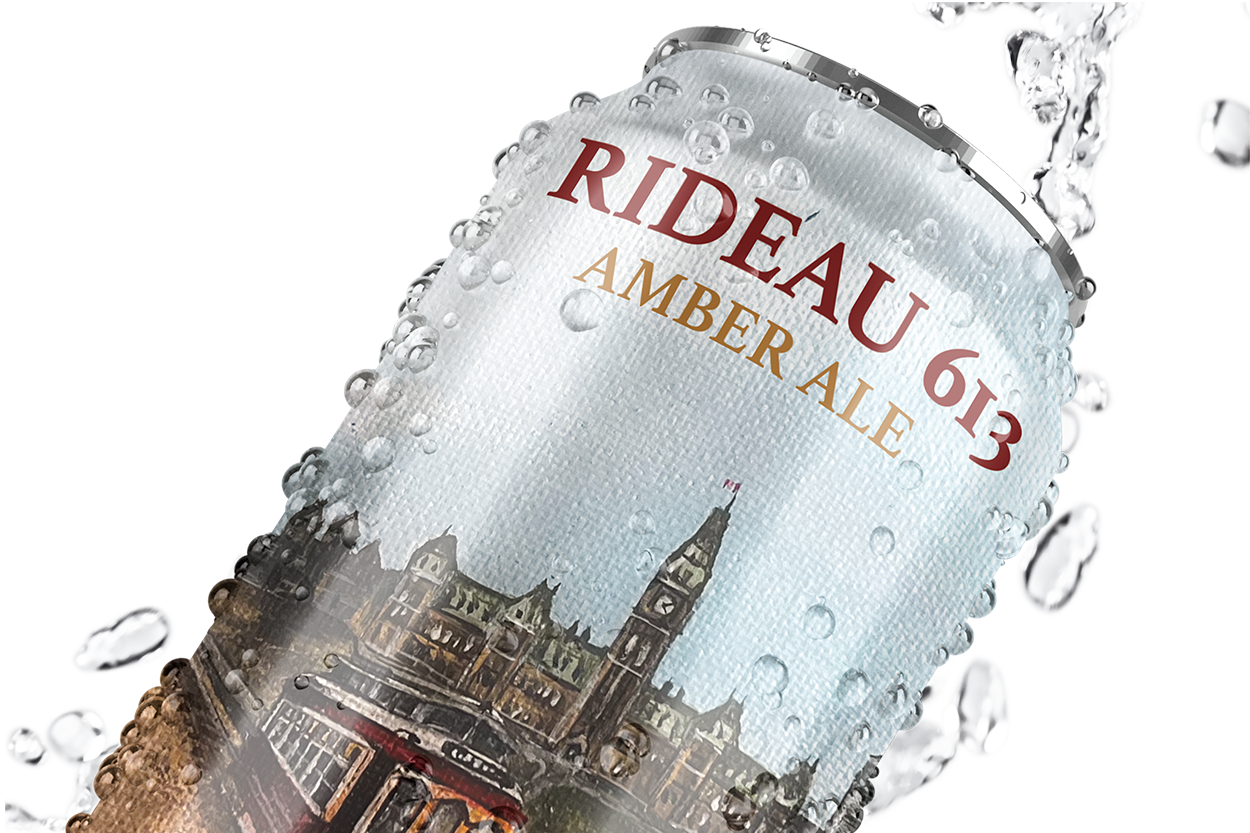
Building on that foundation, the paintings were translated into clean, production-ready designs that preserved their original texture and charm. A thoughtful design process ensured that colour, typography, and layout aligned with Kichesippi’s brand system while maintaining clarity on shelf. The result is a pair of expressive, cohesive labels that bring Ottawa’s visual culture into a modern packaging format.
Authentic Artwork, Contemporary Packaging

Heritage on Display
The final solution drew directly from the rich history embedded in the original paintings. Each artwork highlights a defining part of Ottawa’s story—the Experimental Farm’s agricultural legacy and OC Transpo’s evolving role in shaping the city’s movement over time. By translating these scenes into bold, wrap-around labels, the project preserved their historical character while adapting them for contemporary production. Subtle refinements in colour, composition, and texture allowed the designs to maintain their archival charm while becoming clear, market-ready packaging. The finished cans honour the city’s past in a format that feels fresh, collectible, and aligned with Kichesippi’s commitment to celebrating local heritage.